Processus structuré de développement de sites web et d'e-commerce
Défi
Many website and e-commerce projects start with development too early.
Businesses often have a general idea of what they want, but important questions regarding user journeys, content structure, navigation, functionality, branding, and conversion goals are not yet fully defined.
When design and development happen simultaneously, misunderstandings can occur, requirements change during implementation, and projects become more expensive and time-consuming than necessary.
At the same time, user behaviour has changed significantly. For many businesses, the majority of website visitors now access content via smartphones rather than desktop computers.
A modern website therefore needs to provide an excellent experience on mobile devices first, while also working seamlessly on larger screens.
Solution
At Soludoo, we follow a structured process that begins with understanding the client's business, goals, target audience, and operational requirements.
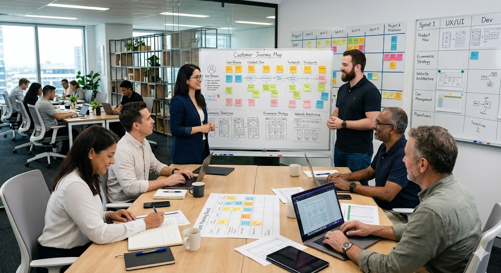
Before development starts, we create a complete design and process concept in Figma.
This includes:
- Page structure and navigation
- User journeys
- Website content structure
- E-commerce workflows
- Contact and enquiry processes
- Checkout and conversion flows
- Visual design and branding
- Mobile and desktop layouts
The purpose of this phase is not only to define how the website should look, but also how it should work.
By visualising the entire project in Figma, all stakeholders can review, discuss, and validate the concept before development begins.
This significantly reduces misunderstandings, avoids unnecessary rework, and creates a shared understanding of the final solution.
Once the design and processes have been approved, the website or webshop is implemented according to the agreed concept.
Bénéfice pour l'entreprise
- 1
Périmètre de projet clair avant le début du développement
- 2
Risque réduit de malentendus et de changements coûteux
- 3
Meilleur alignement entre objectifs métier et réalisation
- 4
Expérience utilisateur améliorée sur tous les appareils
- 5
Processus de développement plus rapide et plus efficace
- 6
Meilleurs taux de conversion et de demandes
- 7
Plus grande transparence du projet pour toutes les parties prenantes
- 8
Base solide pour la croissance et les évolutions futures
Approche mobile-first
We design websites using a mobile-first methodology.
This means that the user experience is first optimised for smartphones and smaller screens before being adapted for tablets and desktop devices.
There are several reasons for this approach:
- Mobile traffic continues to grow across most industries
- A simpler mobile layout helps focus on what is truly important
- Performance and usability improve
- Content becomes easier to consume
- Conversion processes become more efficient
Once the mobile experience is refined, the design is expanded for larger screens to provide an equally professional desktop experience.
Résultat
The client receives a website or webshop that is based on clearly defined business processes, user journeys, and design concepts before a single line of code is written.
This approach creates greater planning reliability, reduces project risks, and leads to a better final product for both the business and its customers.
The result is a modern, scalable, and user-friendly digital presence built around real business objectives rather than assumptions.